the EMprint Portfolio is now located at: emprint.net/work
and the new EMprint letterpress blog can be found here: blog.emprint.net
July 23, 2011
April 1, 2008
Big Sur modern

To set the scene for their Big Sur wedding, these clients wanted to bring the 'wow' factor of redwoods as well as the expansive vista of the rocky coast to their invites. The graphics were hand-drawn digitally and then printed in one color. I'm so taken with how the redwoods turned out that I plan to print some notecards with the same design, soon.
March 30, 2008
the owl and the pussycat get married


For a poet and an illustrator, a perfect fit, in life...and on their invites. The owl and pussycat graphics were drawn by the professional-illustrator groom and the text was professionally edited by the bride (and arranged in 'waves' by EMprint). The result of our collaboration is so delightful. I have hopes to adapt the design for a limited edition broadside print in the near future. [The first pic is the front of the folded card, the second is the inside of the card. Click on the pic to see a bigger version - even the tiniest text (3.5 pt!) is perfectly legible.]
March 28, 2008
pretty peonies

For my dear friends, Sarah & Armand, an invite set inspired by the peonies destined to adore their wedding celebration. The blossoms were hand drawn and the delicate lines were printed in two colors, with a distinctively different layout for each of the three pieces. Matching sage green envelopes add dimension to the collection. After printing, the invites were each hand painted, to add depth.
March 20, 2008
seriously hip biz cards

One side: Young Voters, Other side: MTV. Riffing on the logos for these two organizations, we ended up with some pretty awesome cards. How many people have a blue donkey (that actually looks cool) on their biz cards?
March 10, 2008
marriage records cards

Designed by the typographic genius behind Veneer magazine, with the added bonus of two rounded corners. How smoothly these cards will slip into a wallet!
December 22, 2007
Lummi Island, by moonlight

For a wedding on Lummi Island, a save the date postcard print of the island, by moonlight. Printed in a warm antique brown, with the info on the back. I was especially happy with how the moon came out in the print.
December 15, 2007
artist book cover

A letterpressed artist book cover for Prairial, Year 215 by Melanie Gilligan. Created in a small edition for Veneer Magazine 02/18.
November 1, 2007
Serpentine

This bold design accentuates the letterpress impression, with its fine lining and 'cutout' text, which can only be expected from the very talented designer Molly Tuttle. When Serpentine Restaurant was featured in the SF Bay Guardian, their cards were given equal billing with the beautiful food (in the pictures, at least). And Serpentine is doing so well, we may need to reprint soon!
October 13, 2007
Festive Poinsettias

These were created for a holiday party / fund-raiser. The poinsettias were hand-drawn and printed in two colors. I liked the results so much, I printed some notecards from the same design. Look for them in my Etsy store closer to the holidays, or email me anytime to place an early-bird order.
September 1, 2007
Tropical Palms, part two

For the invitations, we took the ornate tropical design a few steps further. Again, the contrast between the detailed botanical drawings and the almost-rococo border and flourishes produces a classy, not kitschy, tropical flare. These botanicals were hand-drawn with attention to the fine details. One particularly unique feature of this invite set is how the three inserts feature the same design, but are cut off at decreasing heights. When stacked together, the three pieces fit together seamlessly, even hiding the text behind each successive piece. This was truly one of the most delightfully elaborate designs I've ever worked on.
August 20, 2007
new EMprint cards!

I couldn't resist using my newly-acquired wood type for some new EMprint business cards. Each card is unique, as I printed the front in 2, 3 or 4 different colors, slight offsetting the two different prints of either 'EM' or 'PRINT' by varying amounts. Other colors and shades are produced where the prints overlap. I'm smitten with the bold simplicity of the typography and love handing them out.
August 10, 2007
VeNEER business cards

Lovely typography, in classic Baskerville, for the unique and challenging publication, Veneer magazine.
business cards, for the family business

Our family's gourmet vinegar business required cards, at once unique and professional, artisan and classic. I had such a hard time finding the right font for the business name, that we ended up using the handwriting of 'George Paul' himself. Having our contact information on the backside gives recipients a few moments to absorb the impression of the letterpress, before turning it over to find the 'details'.
July 15, 2007
Sandhills Sweethearts

Simple and lovely, this invite used the echinacea flowers from the Pacific NW invite as the central theme. It also has a similar landscape format, but with only three panels. [The last panel, a map, is cut off in the picture above.]
June 20, 2007
Pacific NW Landscape

For my dear friends Dana & Daniel, I wanted to create a design to really set the scene for their Pacific Northwest farm wedding. Drawing inspiration from the Gorge, Mt. Hood, and photos from the actual farm location, I created a series of drawings, which were arranged as a landscape. The invite text was nestled among the barn and pear tree and the RSVP and map were printed on the backside. After printing, I added a few splashes of watercolor to bring a bit of color to the scene - blue for the Columbia River, red on the barn, green for the mountain tree-line and golden yellow for each little pear on the tree. The expansive invite was accordion-folded to fit in a modest sized envelope, which featured a detail of echinacea on the back flap. [I couldn't scan the whole invite at once, so I split it into two pieces for this entry - you can see where the barn matches across the two pieces.]
June 5, 2007
Tropical Palms, part one

The challenge of this design was to evoke a tropical paradise, without seeming kitschy. This was achieved in part by overlaying the palm frond sketches with an ornate border and flourishes. The result is very classy, with a lovely tropical air. Printing a bit of the palms on the envelope made this set extra special.
May 17, 2007
classy shells

This classic beachy look was achieved with true-to-life seashell etchings and a soft pallette of beach sand tan, crisp water/sky blue, and cloud white papers. A casual tone was set with the less formal font choices and rounded corners. I especially love the bride's idea to make all three inserts the same size.
May 10, 2007
poem invitation


This phenomenal invite was designed by the bride and groom. The panels of the invitation are formatted into one long strip (which was accordian-folded). A poem was 'blind' pressed (printed without ink) along the entire length, with only one line, on the first panel, printed in deep red. The traditional invitation text was printed in black inbetween the lines of the poem throughout the additional three panels. This was a challenging piece to print, but the result was immensely rewarding for its beautiful simplicity. (I have yet to capture the beauty of this invite in a photograph or scan - the two above give a mere hint at the effect of the blind pressed poem.)
May 3, 2007
'hand map' invitations

These truly unique wedding invitations were designed by the family of the bride and groom. With the groom from Alaska and the bride from Michigan, a ceremony in each location, and both states represent-able with hands...they chose this fun, personalized way to represent the joining together of their lives.
April 14, 2007
modern floral

This lovely design was originally conceived as asian-inspired cherry blossoms. As the design evolved, incorporating modern styles and fonts with a soft vintage blue, the blossoms transformed (in my mind at least) into forget-me-nots. These were printed on extra thick, stiff watercolour paper for a truly exquisite tactile effect.
April 10, 2007
brilliant deco design

This design was created from a wonderful array of inspirations: the Art Deco architecture of the wedding locale, a drawing by the bride of her favorite flowers, as well as a very fun color pallette. The result is lovely ~ bold, yet cheerful.
April 1, 2007

This is an adaptation of an Arts & Crafts inspired design I created last year. The customization of these pieces didn't end at the design, however. Unable to find the perfect shade of green paper, we had it handmade and custom-color-matched by the very lovely and accomodating folks at Carriage House Paper.
March 30, 2007
classic & meaningful

These invites were created for a couple getting married in a former cigar factory, under the Brooklyn Bridge. The fonts and embellishments were chosen to match the style and tone of the bridge image (found on an antique postcard) and the "cigar paper" cigarband seemed an appropriate way to tie it all together.
March 21, 2007
charming, yet professional

Another identity design by Molly Tuttle. The block of green ink creates an embossed look to the non-inked text within - a very striking effect.
February 22, 2007
wood etching postcard
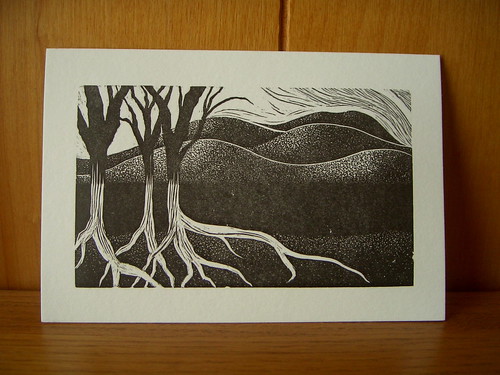
I spent many enjoyable hours etching this woodblock. Wood etching is done with special etching knives into very hard end-grain woodblocks. Wood etchings are different from wood-cuts, which are carved in the same plane as the grain of the wood. You can achieve an incredible amount of detail with wood etching, though it is incredibly time-consuming.
I letterpress printed a small edition of 20. They are available for sale in my Etsy Shop.
February 19, 2007
Robert Frost print

I printed this Robert Frost poem last year as a commissioned work for a client. The text is hand typeset in 72 pt. Garamond and 24 pt. Century Schoolbook. The abstract flowing water illustration was hand-inked and printed from a paper carving (cut pieces of paperboard mounted type-high in the pressbed). I have a few prints leftover, so I am now offering them for sale on my Etsy shop. There are 11 different prints available, each on different papers, with a unique abstract illustration.
February 10, 2007
simple elegance

This classic design is simple, yet elegant. The flourishes adorning the top and bottom of each text block were created especially for this couple.
February 6, 2007
vintage lilac scrolls

I created this design using elements from a wedding invitation I printed last year. The muted lilac and charcoal tones give the design an elegant, vintage feel. This is a versatile design that could take on a different tone with the choice of an alternate color pallette.
January 26, 2007
freshly printed biz card
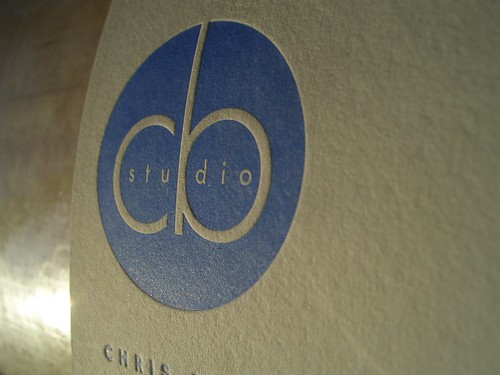
This card design (by Molly Tuttle) was just PERFECT for letterpress. I love how the CB studio pops out from its printed surroundings. This photo was taken just after hand-cranking a print and shows the card still on the press. The afternoon sun made for a striking capture of this really nice business card.
January 17, 2007
delicate floral vine design


This original design was inspired by a piece of vintage fabric. The vines and blossoms have a delicate yet crisp look. I especially love how each petal is pooched out by the impression of its outline.
January 14, 2007
doily cards

I just LOVE how this biz card turned out. The design was a collaboration between the client (a dear friend of mine) and myself. We used a scan of an old doily scrap for the background graphic and her very own calligraphy for her name.
January 11, 2007
brooklyn bridge card

For a wedding near the Brooklyn Bridge, this etching from an old postcard seemed just perfect. The bridge was printed in a muted tone and then the text was overprinted in a rich, deep red ink. Matching red envelopes made these a special treat in their guests' mailboxes.
January 5, 2007
coffee-coaster cards

This business card design was provided by the client/artist. We ended up printing on drink coasters to get the heft and thickness we wanted for the cards. The coasters only came in white, so I soaked them all in super strong coffee to get the color we wanted. The mottled result of the coffee staining added a complimentary rustic flare to the design.
Subscribe to:
Posts (Atom)