January 26, 2007

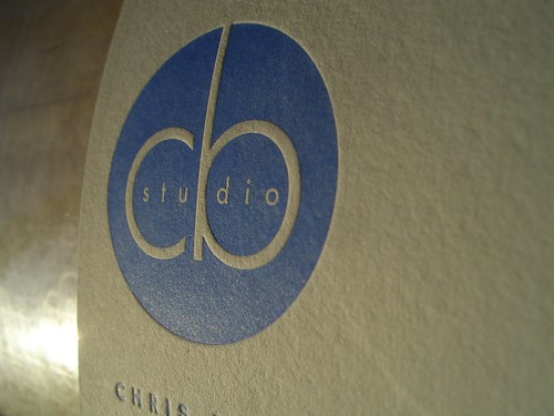
freshly printed biz card


This card design (by Molly Tuttle) was just PERFECT for letterpress. I love how the CB studio pops out from its printed surroundings. This photo was taken just after hand-cranking a print and shows the card still on the press. The afternoon sun made for a striking capture of this really nice business card.

January 17, 2007

delicate floral vine design


This original design was inspired by a piece of vintage fabric. The vines and blossoms have a delicate yet crisp look. I especially love how each petal is pooched out by the impression of its outline.

January 14, 2007

doily cards


I just LOVE how this biz card turned out. The design was a collaboration between the client (a dear friend of mine) and myself. We used a scan of an old doily scrap for the background graphic and her very own calligraphy for her name.

January 11, 2007

brooklyn bridge card


For a wedding near the Brooklyn Bridge, this etching from an old postcard seemed just perfect. The bridge was printed in a muted tone and then the text was overprinted in a rich, deep red ink. Matching red envelopes made these a special treat in their guests' mailboxes.

January 5, 2007

coffee-coaster cards


This business card design was provided by the client/artist. We ended up printing on drink coasters to get the heft and thickness we wanted for the cards. The coasters only came in white, so I soaked them all in super strong coffee to get the color we wanted. The mottled result of the coffee staining added a complimentary rustic flare to the design.